
TASK
This project aimed to short-circuit my existing creative process by suggesting a range of new non-linear prompts to respond to and learn from, each taking 5-10 minutes of creative activity. Aiming to fail and learn through the process rather than trying to create something I knew I could achieve.
Useful quotes from Course Text pp 49-50:
In all creative processes a number of possible ideas are created (‘divergent thinking’) before refining and narrowing down to the best idea (‘convergent thinking’)…But the Double Diamond indicates that this happens twice – once to confirm the problem definition and once to create the solution. One of the greatest mistakes is to omit the left-hand diamond and end up solving the wrong problem.
Mat Hunter, Chief Design Officer at the Design Council.
If we make assumptions about what we can and can’t do we are locking off a range of potential solutions –
Downs 2011 p144
Non-linear creative prompts
- Define it
- Make it bold
- Let’s look at the real thing
- Introduce time, motion and sound
- What is the key moment?
- Create a variation
- Connect play, fantasies and daydreams
- Combine seemingly arbitrary content
- Erase the distinctions between original and copy ??
- Consider again your motivation
- Make it obvious
- Make it ambiguous
- Remind yourself
- Bounce around at speed
- ‘We’ve got a problem Houston’
A Street Corner in Addis
For this exercise I chose a photograph of a street corner in Addis Ababa, taken on an old iPhone from the luxurious safety of a big window next to my breakfast table in an international hotel. This is one of a series of images I started to look at in Illustration 2 : Oromia Reflected Journey and am intending to take further in Sustaining Your Practice.
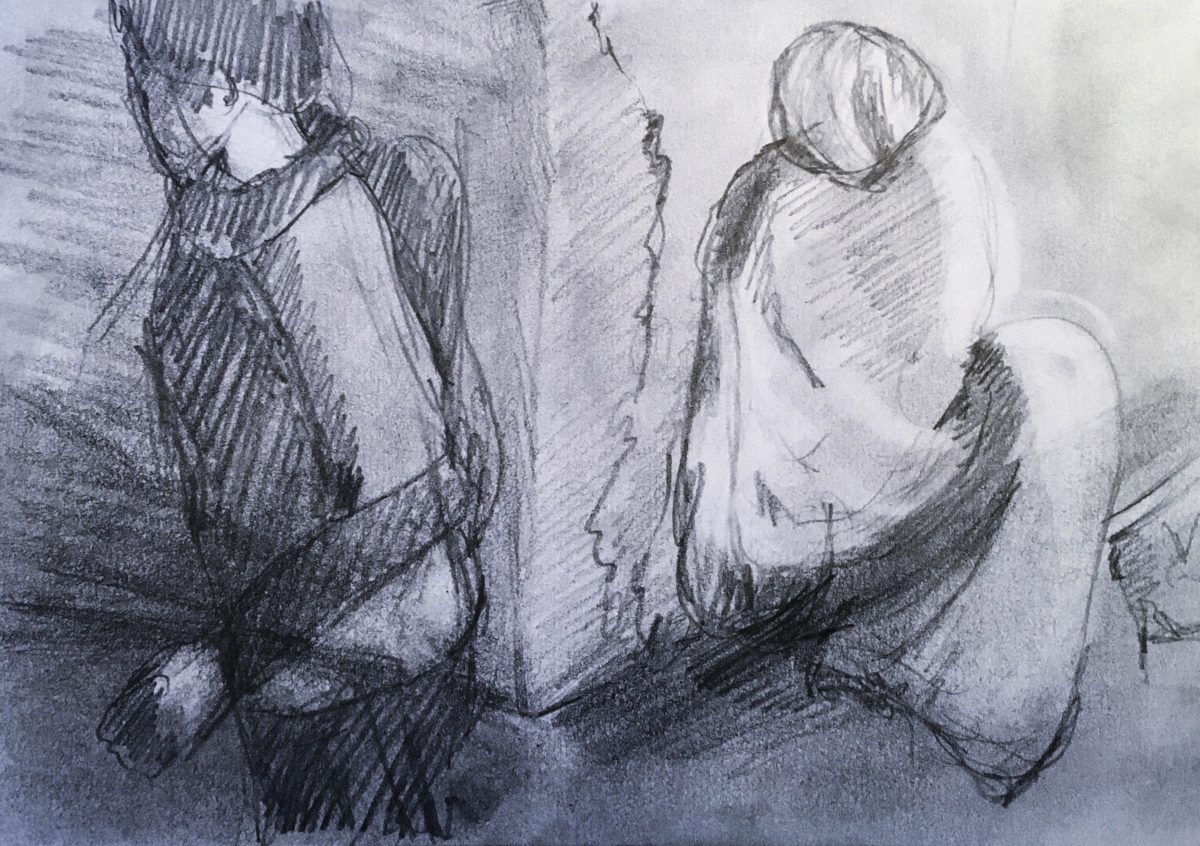
I spent 5-10 minutes on each of the images below, taking each prompt roughly in order – though as I went through and amended I found some of the images I had produced were a better fit for a different prompt. So I went back and redid the original. I was asked to ‘ fail and learn through the process rather than trying to create something you know you can achieve’. I used a combination of quick sketching and layering/manipulation on the iPad. (Click on each image for further details of how and why this image evolved.)


Assessment and
further questions
In 2019 when I did the project, I thought my three best images were:
The image that I thought best reflected the type of approach I might take for at least some of my work in future was ‘Remind Yourself’ going back again to the original photograph, and incorporating the idea of making the homeless person ‘real’ through using the photograph and the passer-by earphones from ‘add sounds’. It increases the sense of crowd and many people rushing by through repositioning the people – still taken from top view from my window. Though I recognised that it needed a lot more work to really think through both conceptually and visually, and to bring to a good technical level.

My tutor thought this version reduced the physical distance between the passers-by and the homeless person, and increased the spaces between the individual passers-by, enhancing their physical and visual separation from each other. Undermining the sense of isolation in the original photograph.
On reflection in 2020, if I were to go with this image I would still go with roughly the same composition – as it is people rushing by close to the homeless person, acting as if they do not exist and almost tripping over them that is largely the point. But I might change the tonal structure to have the people in the street lighter and brighter and the homeless figure hidden in the shadows. Alternatively the homeless figure could be sitting in the blaze of the midday sun – aiming to be seen and in a spot where no one else would sit. A further question is whether I would add motion blur to the figures going past.
This raises a number of issues about what I might be trying to say:
- Is the focus the isolation of the homeless person? their invisibility? their lack of options where and how to sit?
- Is the focus the passers-by and the way they are all immersed in their own private worlds, not noticing each other – a different focus from my original sketch?
- Is it that the passers-by are going in the direction of the bank, future and progress, while the homeless person is sitting stuck still?
- Is it the relationship between them?
- Am I just trying to reflect and comment what I see, or attempt to suggest how things might be different?
I would also like to get much more dynamism in my drawing along the lines of my very quick sketch.:
Reflections on the process
Reflections 2019
This process was very useful for promoting some lateral thinking around how I work with photographs. The potential of generating more arbitrary images has been more part of my imaginings with found images and textures. But I could use the approach more in documentary – well beyond Assignment 2a. Exploration has always been part of my collage and photo-montage process – working on the iPad or with printouts with elements in different sizes, colours and levels of simplification to explore different possible visual relationships. But going back and forth between ‘obvious’, ‘ambiguous’, bold, reminding and revisiting etc gives a more systematic approach to this exploration. Even though here I did not add much of the sound and movement or fantasy, these elements were implicit in subsequent images.
The range of different permutations and combinations are endless. So the initial selection of images will be key. Though this will need to be a reiterative process if I am to really think around the ‘left hand diamond’. In documentary also ‘thinking around the problem’ is as much a question of research to think around the issue itself rather than just random generation of thumbnails.
It is also a process that I could use with any photograph to generate ideas if I am responding to a client brief.
The big issue as always will be time – here I was only working with one photograph rather than a series. Ways of Integrating research (content/conceptual as well as visual), convergent and divergent thinking and critique is something that I will think about systematically in practical detail throughout this module. Repeating the questions from this exercise, and probably identifying new ones.
Reflections 2021
!! To do